New brand and website: the next chapter for Community Work Australia
As the peak body representing community work professionals across Australia, we’ve evolved significantly in recent years. Our new brand brings that evolution to life, celebrating the values that define our profession: integrity, connection, inclusion, and growth.
This refreshed identity isn’t just about visuals. It’s about reaffirming our purpose - to advance the community work profession and to champion the people who dedicate their lives to supporting others and strengthening communities.
A new website for a new era
Alongside our refreshed brand, we’re also proud to launch the new Community Work Australia website which has been designed to be clearer, faster, and more accessible for every visitor.
The new site brings together everything you need in one place: pathways to accredited courses, practical resources for professional development, member stories, and the latest updates from across the sector. It’s built to reflect the diversity of our audience — professionals, students, migrants, and educators — and to help you find what you need with ease.
Each page has been designed to make your experience simpler, faster, and more intuitive.
Whether you’re exploring new career opportunities, renewing your membership, or accessing the latest sector insights, the new site makes it easy to find what you need and showcases the breadth of support available to community work professionals across Australia.
This relaunch marks the beginning of a more connected and forward-looking digital presence - one that celebrates the profession and supports those working to strengthen communities across Australia.
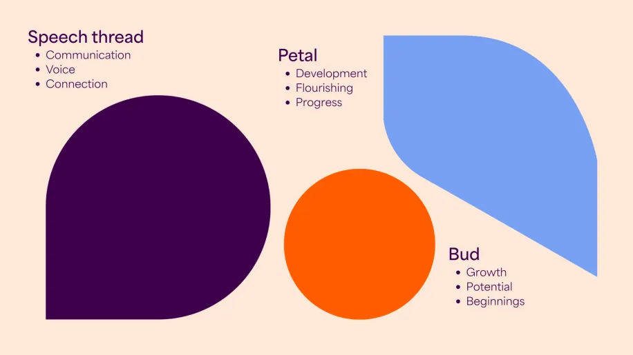
The story behind our new logo
Our new logo lies at the heart of this transformation. Inspired by the form of a flower, it serves as a modern symbol of growth, connection, and togetherness — values that run through every part of community work.
Each element of the logo has meaning:
The Bud marks our starting point — ready to grow, flourish, and embrace new opportunities.
The Petal symbolises renewal, development, and the promise of new beginnings.
The Speech Thread represents communication and the amplification of community workers’ voices across Australia.
Together, these shapes represent the coming together of individuals, communities, and the profession itself — united by a shared purpose and driven by connection and hope. It’s a logo that not only identifies us but tells our story: that when we work together, we help communities thrive.
A brand built on purpose
Our new identity has been designed to express who we are and what we stand for. It reflects our commitment to professionalism, compassion, and progress, while honouring the roots of an organisation that has supported the profession for decades.
As Community Work Australia continues to grow, our visual identity needed to evolve with us - becoming more contemporary, consistent, and adaptable across all our communications. From digital channels to publications, the refreshed brand creates a clear and confident presence that speaks to our national role and our shared purpose.
Access papers, community and support with a Community Work Australia membership
About Community Work Australia
From setting educational standards through to determining an ethical practice framework, we support community workers in every sphere of their work life.
Set up over 50 years ago, we exist to ensure that the community benefits from an ethical and well-qualified community work labour force.


